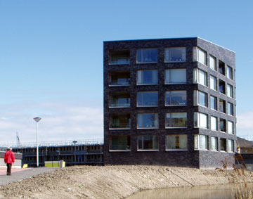
new building
- ACJ wrote on 2004/04/13:
- It looks tiny.
- P01 wrote on 2004/04/14:
- The slope of the roof is interresting. With the perspective, it's almost aligned with the front of the building. And the dark color gives a precious aspect.
Interaction design • webdevelopment • web art • photography
