my phone can't show char ✽ (HEAVY TEARDROP-SPOKED ASTERISK), so fire flower becomes fire squares http://milov.nl/e/124 http://twitter.com/milo/status/249926131267026944/photo/1
September 2012
made another css-only animation, 124 - fire flower: http://milov.nl/e/124
July 2012
fixed 123 http://milov.nl/e/123 counter-rotation on ipad by replacing (unsupported?) animation-direction:reverse with separate animation rule
123 (css animation) - combined my old fave, border-style dashed, w/ border-radius 50%. Only works in Chrome, it seems: http://milov.nl/e/123
here's a timelapse animation I made last year while cleaning out some bookshelves: http://milov.nl/e/122
added some info and historical context to my Experiments page http://milov.nl/experiments/
May 2012
121
March 2012
120

a css-only (no js) mouseover animation using :hover, border-radius, transform and transition properties: http://milov.nl/e/120
February 2012
my favourite photos of 2011: http://yearfave2011.milov.nl
September 2011
also, photo series on http://milov.nl/photos/ now use smooth scroll pageup/down effect similar to my work for @nrc inbeeld http://nrc.nl/inbeeld/
retroactively adding several photo series of events/trips/concerts/meetups of the past 6 months to http://milov.nl/photos/
July 2008
something new
117.milov.nl - a bit of fun with border-style: dashed;.
Exact rendering depends on browser model and window size. Warning: hypnotizing!
October 2006
NAI in green
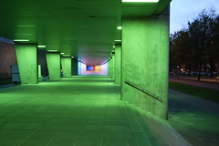
Like seemingly every other Rotterdam Flickr user does at one point, I finally got some pictures of these cool lights at the NAI!!
Also, I'm experimenting with a new photo interface, serving 1024px-wide jpegs of my photos live from flickr.com via milov.nl/flickr/275545243-style urls. Still trying to figure out how to best go about structuring things so I don't have to upload and tag photos twice (once on flickr and once here).
May 2006
quicklinks back in main column
After two years of dumping quicklinks into a separate column, I'm going to try re-inlining them into the main weblog again for a while... going for more of a single-stream-of-consciousness type of thing, while shuffling the (non)design of this site around a bit. The linkdumps are still available as one giant flat list at milov.nl/tag/linkdump - currently at 660+ items.
Also, when viewing any of the large-view photo pages (such as this one), clicking the photo now jumps to the previous photo instead of jumping back to the main weblog, allowing easy click-click-clicking through a whole bunch of shots, photolog-style.
December 2005
fave photos of 2005
I shot a little over 18,000 photos this year. Of the ones I posted here, these are my personal favourites:
read more »October 2005
t
e
x
t
b
r
e
a
k
August 2005
chance composition
self-referential
July 2005
furusukuriin karaapikkaa
This dhtml colour thing, which I made 6 years ago, still gets new bursts of hits every now and then... Last week it was Chinese MSN Spaces, currently it's making the rounds on a number of Japanese blogs, and I'm having some fun trying to decipher what people write about it.
In the case of lucky-bag.com, I recognized most of the Katakana in the title, and I know it's used to represent foreign words, but it still took me quite a while to realize what on earth furusukuriin karaapikkaa
could mean. Pronouncing it out loud finally revealed the answer.
June 2005
This is the new server!
photographic favicons
Tee hee, each photo entry on this site now gets as a unique favicon a 16x16 version of the photo itself. Looks kinda neat when you open a bunch of them in tabs (try it out by middle-clicking some of the id numbers of the entries below).
I love it when ideas go from thought to successful implementation in less than 10 minutes.
Update: adding a photo to this entry so you can see it in action right here...
new feeds view
milov.nl/feeds/
I'm having a lot of fun styling my new simple and lean blo.gs-powered feeds view. Check it out in a browser that supports modern CSS (i.e. not IE) and observe li:hover, ::after and content: attr(href) in action...
Update:
Well, it seems blo.gs is offline for a bit after being sold to some unknown party, so the feeds view might not get updated for quite some time. Anybody know any other good centralized weblog update trackers? I tried BlogRolling for a while but it only seemed to indicate one new updated weblog per day.
Update 2:
blo.gs is back, yay! Turns out it's been acquired by Yahoo!.
May 2005
tset
March 2005
February 2005
January 2005
How to display <ul> elements as a flat comma-separated list (now in effect in the main menu and links list in the left-hand column):
ul.links { list-style: none; margin: 0; padding: 0; }
ul.links li { display: inline; }
ul.links li:after { content: ","; }
ul.links li:last-child:after { content: ""; }
The advantage of this is that changing the default separator from a comma to | or - or whatever now means only having to change one character in the stylesheet.
Note: Internet Explorer doesn't support the css content attribute or :after and :last-child pseudo-classes, so the commas won't appear in IE.
December 2004
favourite own photos of 2004
Here's a nice, compact, easily clickable view of all 236 quicklinks I ever posted (well, all those since May 2004 anyway, which is when I first started grouping them in their own category).
November 2004
...and we're back online! (let's hope it lasts this time)
If you sent me any mail in the last 36 hours I might not have received it.
October 2004
tagging is fun
I've been hitting the random link a lot lately, tagging old weblog/photolog entries with multiple categories.
This photo in particular makes me wonder how I ever made do with only one category per entry: I managed to think up no less than 12(!) fitting categories for it.
Negative(!) text-indent is in effect in the quicklinks list (over there on the left of the front page). Handy... applying a style like padding-left: 10px; text-indent: -10px; to an element makes all lines of that element appear indented except the first one.
September 2004
fibonacci
categories per entry
"je moet wel af en toe wat nieuws posten op je site anders zit ik me ook maar te vervelen"
August 2004
inline comments
My monthly archive and category pages now show the comments for each weblog entry inline (instead of only on the specific entry page), which is how it should be, really.
July 2004
random linkage
Click these links a bunch of times then report back here about the interesting things you've found:
June 2004
colour subdomains updated
Rather than appearing as blank pages of a single colour, the colour subdomains now have an info footer showing calculated dec/hex/percentage values, as well as a row of lighter/darker variations.
test: purple, 144.200.180, cc9966, f0f, activecaption
colour subdomains
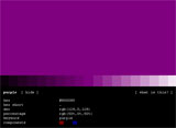 Some time ago I implemented a couple of php subdomain detection tricks for quick testing of hex and rgb colour codes: typing ff0.milov.nl, cc6633.milov.nl, 100.100.200.milov.nl, 0.255.150.milov.nl (and so on) in your Address bar will fill the browser window with that particular colour.
As of today, in an attempt to pollute subdomainspace even further, html colour keywords such as orange.milov.nl, aquamarine.milov.nl, greenyellow.milov.nl are also supported.
May 2004
quicklinks
I've started a little Quicklinks/Linkdump/Remainderlinks (or whatever they're called) list on the left-hand side, below above the Latest comments.
March 2004
Voting has begun for the Dutch Bloggies 2004!
I'm not sure what the rules say about non-dutch visitors (of which I have a lot) participating in the vote, otherwise I'd say give it a go! ^_^
By the way, I've been nominated for the Dutch Bloggies 2004 (our national weblog awards, sort of). Which surprised me since I haven't been doing all that much 'blogging' lately. Coincidentally I'm the only one in my category that doesn't write in Dutch. :)
experiment
<span class="you">
If you've recently posted a comment and you don't see your own name highlighted in blue, reload.
January 2004
A checklist of i.am/bald numbers I really should update since they don't work or no longer work in Mozilla Firebird (my default browser for over a year now):
10, 14, 20, 23, 25, 26, 28, 30, 31, 33, 34, 35, 36, 37, 39, 40, 42, 44, 45, 46, 49, 50, 51, 55, 56, 57, 62, 65, 66, 67, 69, 71, 72, 73, 74, 77, 79, 90, 92, 94, 95, 96, 97, 98, 99, 102, 108, 109, 112, 113.
December 2003
November 2003
 114.milov.nl - a starry mouse-driven snowflake generator of sorts, made with Processing. Simply drag your mouse over the applet and watch the patterns form. (But don't stare at it for too long or you'll see it every second you close your eyes; believe me, I know.)
I'm so used to thinking in layers (dhtml mindset) that it's always a nice surprise to be able to move thousands of pixels around in a Java environment.
New background image: 'Small City Lights' (reload if you still see the old one), featuring the building of 2335 and the bridge of 1639.
Don't know how long it will last; it sort of forces me to add some colour to the rest of the design (which is looking awfully grayscale at the moment) to balance it out.
I altered the 'latest comments' listing to only show unique entries, in an effort to prevent older entries from being pushed off the list when one particular new entry generates a disproportionate amount of response.
...not that I mind getting lots of comments, ya know :)
October 2003
XHTML 1.1
Although I'm not quite sure why yet, I changed the doctype of this template from XHTML 1.0 to XHTML 1.1 and am sending a Content-type: application/xhtml+xml header to browsers that support it, meaning Mozilla will regard each page as xml and won't show the content if there's an error in the markup.
Which meant spending a couple of hours going through the monthly archives, correcting each entry that triggered an xml parse error. Now all of the 2300+ entries are valid well-formed x(h)tml and I have learned to never ever not end my &'s in amp; or use < instead of < in javascript: hrefs (damn those bookmarklet for-loops).
113.milov.nl
something to stare at
referrers per entry
I've been logging all specific referring urls for each weblog entry for a while now, but never really made them visible. Until now, that is. Try a couple of random entries and you're bound to see it in action somewhere...
To prevent the entry pages from turning into some sort of Google trap, search engine bots don't get to see the referrer lists at all (via a User-Agent check of common bot names).
redesign
Doing a little redesigning... Usually my redesigns start with a new background photo, but since I couldn't decide on a good one I did the layout first this time (along with a reworking of the php and html code).
A big change is that I'm now showing inline entry titles for some entries (until now the titles were only visible in the <title>-tag), so you know what you're reading or looking at.
The html for this 'ere weblog column is still rather tag-soupy at the moment getting better, but the menus on the left have been converted into lean <ul> machines with a hover effect inspired by Listamatic.
My guestbook has been getting quite a bit of comment spam lately. Someone from *.wanadoo.fr (who isn't POI) is posting comments under a variety of names and urls, all pointing to crappy casino/pharmacy/ringtone sites. I've been letting it slide until now because I sort of admire his/her effort of thinking up new "compliments" about my site, as if they were genuine guestbook entries.
Then there's the repeated buup114 spammer, who, according to my logs, opens entry 1516, posts the same exact comment and leaves again. Never mind that the text is completely indecipherable...
I like how I've maintained an almost zero percent moderation rate with regard to comments (I don't even remove double-posted comments), but I think I will be removing at least the urls from these ones, to discourage further attempts at enhancing ones Pagerank like this.
More discussion on comment spam at Simon Willison, Jeremy Zawodny, JayAllen and dive into mark.
August 2003
I'm, like, really anxious for people to post more comments so I can see more of the new "x comments by name1, name2 and name3" commentlink-syntax in action... That "and" makes the link look so much more interesting, as if name1 and name2 are really having a discussion with name3 and each other.
Cruft-free URLs in Movable Type [diveintomark]
Article URLs week: Recommendations | ashbykuhlman.net
How to recognize a Weblog tool by its permalinks
Been reading these articles about reducing cruft, or unnecessary info, in urls. Now, my permanent urls of the form milov.nl/entry/123 already were quite short, but then I got to thinking: do I really need that obvious /entry bit in there? So I wrote an .htaccess rule to enable permalinks of the amazingly compact form milov.nl/123, which is now the default (the old syntax still works as well, of course).
July 2003
Look, a new header image! Only 6 months since the previous changeover, even. Font/colour/layout changes of menu and content columns to follow...
Much thanks to the people of the local construction company for leaving these very tall floodlights standing like this night after night (see also 2211).
June 2003
0x99, 990000, Anil Dash, antipixel, Anywhen, beflix.com, Boing Boing, dangerousmeta, deftone.com, dithered, Eduardo, Eend, Elrado, frownland, Fuckhedz, ginny, glenmurphy.com, Glish, hifidelity.org, idontsmoke.co.uk, IF THEN ELSE, interconnected, Ivan, JRDN, Karma, Kethinov, kottke.org, leuschke.org, lfs.nl, Low, mados, MetaFilter, Midnight Factory, Mijnkopthee, Morg.nl, nickd.org, one.point.zero, pallalink, Pixel Lab, plasticbag.org, pOw, Prolific, Rob, sepi, sikkema.net, suejon.com, Suppose, sylloge, tastylog, thisboyistoast, Timmie TV, vandenb.com, WHEDONesque, wilwheaton.net, woodge.com, Zeldman, ziboy.com, ...
more links >>
May 2003
In case you hadn't noticed already: I expanded the left column with a chronological listing of scripts, graphics and various other 'things of interest', dubbed Output. If it grows too large I might overflow:scroll it, similar to the referrers list.
Yet another attempt at combatting the inevitability of interesting things disappearing all too quickly off the bottom of the page...
fun with subdomains
For a while now, my site has supported custom subdomains... meaning people could type whatever.milov.nl and end up here. Never did anything with it other than redirect all subdomains to the main site - until this morning that is, when I came up with these two uses:
Quick-jump to iambald-number:
Typing 1, 2, ... 112 as a subdomain opens the matching iambald-page. Example: 24.milov.nl, 100.milov.nl, 112.milov.nl.
Colour view:
Want to quickly test what a particular hex or rgb colour value looks like? Try ffcc99.milov.nl, 990000.milov.nl, rgb(51,153,153).milov.nl or any other colour value as subdomain. Providing a handy way to link to or even bookmark one's favourite colours.
Update: even shorter rgb syntax: 250,100,50.milov.nl
112 - marble
for you; something to stare at...
April 2003
milov.nl/entry/random
I made a PHP-version of that random entry javascript, and added it to the end of the left-side Contents menu; so now you can click, click, click for continuous randomness (inspired by Knurpslog).
I'm going to try to not post any photos for the duration of oh, let's say one week, limiting my posts to links, text or artificial images - I'm curious to see what will happen...
Need to break the cycle; even when typing this entry I found myself automatically starting with <img src=...
Update:
In the mean time, you can always jump to a random entry/photo.
March 2003
The Age has an article, apparently also featured in their print edition, linking to my !usedcolors bookmarklet.
I've actually been mentioned in this Australian newspaper before: i.am/bald was Site of the day (scanned page) on 10 april 2000. Had a hard time figuring out how all those .au visitors ended up on my site back then; sadly my webstats still can't detect whether URLs were typed over from newspapers...
The Referrers list (down and to the left from here) now sports a 'hide searches' option, which, when clicked, removes all search engine urls from the list; click again to unhide them... A quick hack to help me see the 'actual' referrers, without all that Google noise.
read more »
I equipped the Latest comments listing (to your left) with comment-position-indicators...
Update: similar indicators now also activated at WHEDONesque.
February 2003
I have been informed my site crashes Safari (that new Apple browser). If you're using Safari and can read this, let me know...
Look, a Latest comments listing! (requested by poi a while ago...)
I also built one of these for WHEDONesque last night.
Now the occasional comments by Googlers finding old entries won't remain quite so unnoticed.
Network troubles :(, old camera broken :(, new camera arrived :), blah, blah...
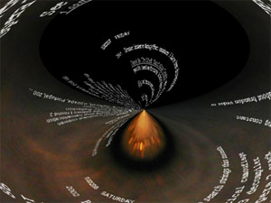
Oh no, entry ids have caught up with the current year!
what the... whaaaa!
January 2003
For the first time in years, I actually added some meta-tags to my main site template: ICBM and DC.title. All for the benefit of finding out which sites are nearest to me, powered by geourl.org.
And on a national level, www.nboogaard.com/map/ is compiling lists of weblogs in Holland per postal code area. [via Mijnkopthee.nl]
Redesign in progress... See 1927 for the source of the new background image.
Update:
After one day, I'm a little doubtful but not annoyed with this background image, so it might even last... Now to mess up the menucolumn and entrylist layout some.
Happy New Year!
December 2002
You may have already noticed, but the little list of names next to the '(x comments)' links below each entry now link directly to the matching urls (if specified).
I retroactively added a bunch of ancient newsitems from various old homepages to the archive, which now goes back all the way to 19991998. Hence the jump in entry ids. :)
November 2002
Hard to believe, but we recently had the 1000th forumpost already...
By the way, do you ever use the recent older entries list (scroll down)?
The server is back online after being down during most of the day... so if you happened to send me an email today, send it again. And if you didn't, send me some mail anyway. :)
October 2002
New feature: scroll down for a list of links to recent older entries.
Attention feedreaders, the new preferred url for accessing my rss-feed is: http://milov.nl/rss.xml
milov.nl/iambald/110.html
I've taken to using
setTimeout(function(){tick(t+1);}, 55);
instead of
setTimeout('tick('+(t+1)+')', 55);
since it's less eval-esque and doesn't require escaping and messy parenthesizing.
September 2002
Testing 'More' feature...
read more »new: milov.nl rss feed, for people who like that sort of thing...
Update to the js photo filters: you can now Shift-click any photo on this site multiple times for 90°, 180° and 270° rotation. Wheee!
How it's done:
someElement.style.filter = 'progid:DXImageTransform.Microsoft.BasicImage(rotation=1)'; //or 2, or 3
Here's an image to test it on:
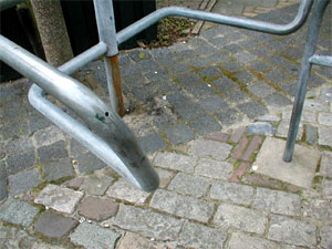
And: it now also works for images in the forum. Useful when viewing the Upside-down photos.
I just added a little extra javascript for Internet Explorer users, to apply some handy filters to any photo featured on this page:
- Shift-click a photo: Rotate 90°, 180°, 270°;
- Ctrl-click a photo: Desaturate (remove colours);
- Alt-click a photo: Invert colours.
Try it with some of the photos below! You can even combine filters. All this by setting one global document.onclick event (no need to add specific tags to each <img>-tag). View Source to see how it's done.
August 2002
00010111
00011000
July 2002
I can always tell the duration of a server-downtime by the gap it causes in my instant-referrer-list. In this case, the site was offline from 09:34 to 14:26.
